|
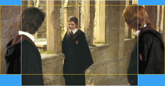
O1
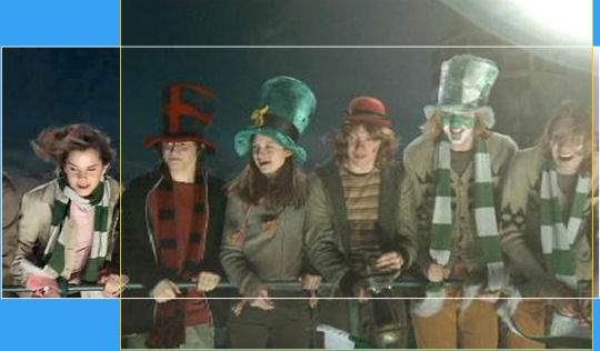
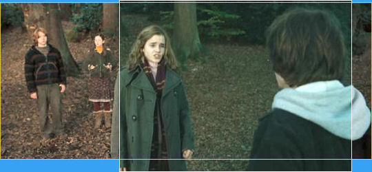
This is one of several shots throughout the movie of a row of three, four or five (or, in this case case, six) characters. This seems to be one of Mike Newell's favourite compositions, of which there are loads of examples in Goblet of Fire (I'll use another couple of examples later on).
In my original comments (before I saw examples from the fullscreen version), I suspected that Fred and George would be the ones being cut from the frame. I didn't expect it to be Hermione! I'm not too keen on this new compsition relegating Harry to the very edge of the picture, which clearly had not been the original intention.
O2
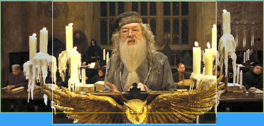
This is just a beautifully framed shot. (Re-read the comments on the "rule of thirds" on the Chamber of Secrets page for more explanation.) The fullscreeen verion causes Dumbledore to look cramped by all those candles instead of having all that space around him as was clearly intended.
03
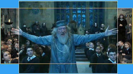
Yet another textbook composition. What's the point of spreading your arms wide if they're not completely visible?
04
In a similar vein, whilst all the characters remain present in the fullscreen picture, they're all crammed in and the shot loses a great deal of its elegance.
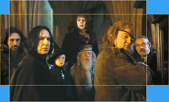
05
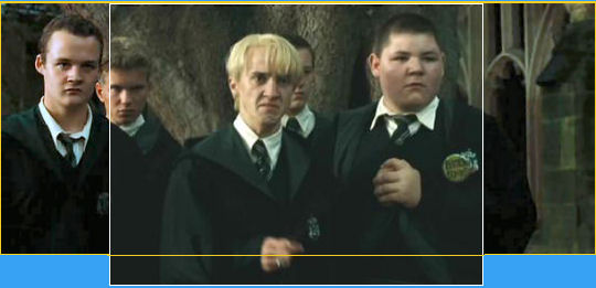
Although several minutes separate this image from the next, the juxtaposition is full of meaning; these are the two opposing "teams" and the shots deserve to be considered together. And both, of course, lose characters in the fullscreen version.
06
07
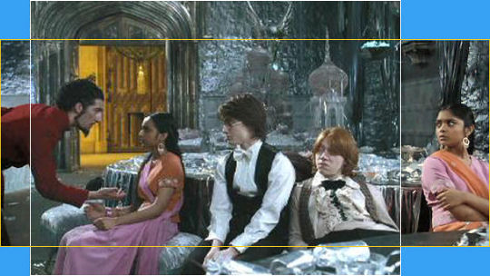
The fullscreen conversion misses the wonderful facial expression on Ron's date's face as her sister is led off/saved from a night of boredom.
08
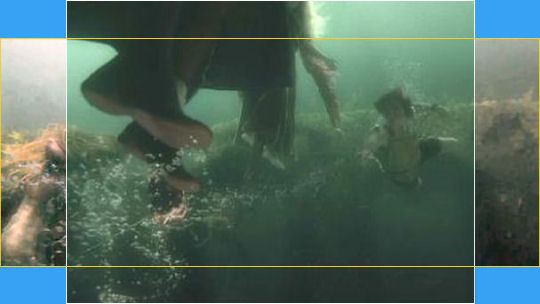
Cedric "zaps" the Mermaid across the width of the screen, which the "fullscreen" version misses entirely.
09
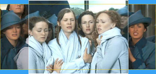
The Beauxbatons girls. Another trademark Newell composition ruined.
10
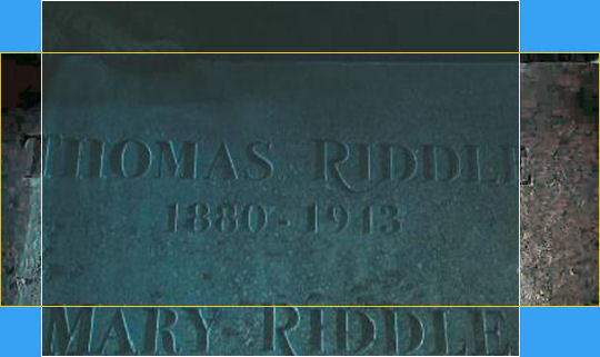
Of course, the "fullscreen" almost fits all of Tom Riddle Snr's name into the screen, but the effect is somewhat ruioned by including his wife's as well.
11
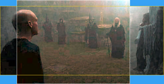
My original comment was "This scene is extremely dark, so it's difficult to make out what's going without contrast enhancement. So I can only assume that the people doing the "fullscreen" transfer simply didn't worry about how much was left on screen." Clearly including the hero of the piece in the shot wasn't a priority...
12
Another couple of examples of having to cut the width of the image so much that we end up what were intended to be light shots with lots of space reduced to having to look for the characters in the above example, and desperately squeezing them in in the one below.
13
|