 |
Widescreen -v- Fullscreen |
 |
 |
 |
 |
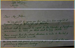
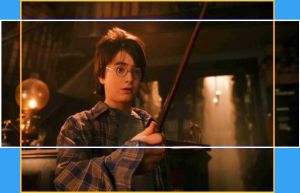
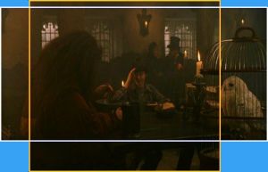
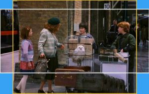
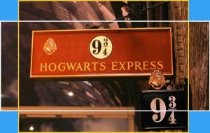
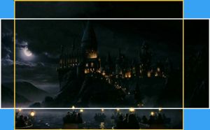
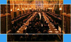
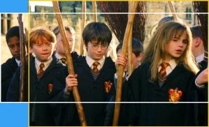
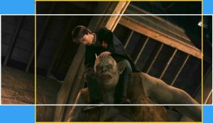
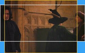
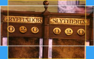
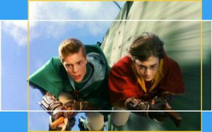
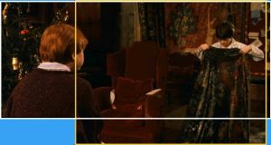
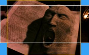
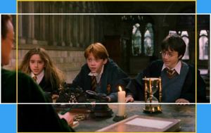
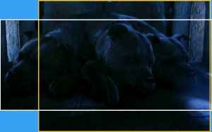
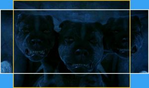
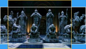
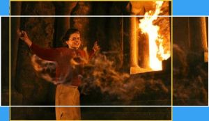
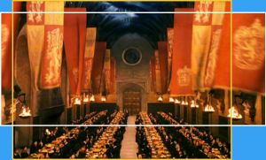
The pictures on this page show what parts of the film negative were selected both for the widescreen and "full screen" DVD releases. The yellow boxes show the "standard edition", and the white boxes the widescreen picture. Note: these are not approximations - these are actual captures from the two versions which have been superimposed on each other. They have not been changed other than to compensate for the distortion of the anamorphic transfer, and a few of the darker pictures have been contrast-enhanced. I've always been a fan of widescreen releases, and it pains me to have to admit that, in my opinion, with just a few exceptions, Chris Columbus and his crew persisently (though regrettably, not consistently!) seem to compose the picture for the standard 4:3 proportions of a TV screen, rather than the 2.35:1 scope of the wide cinema screen. As a result, on the basis of image composition alone, it is very difficult to recommend one version over the other. I've chosen 20 pictures from scenes showing the greatest differences in image composition, ten of which I think look better in widescreen format, and ten in the standard TV format. I should add, though, that it was a LOT easier to find 4:3 pictures better than the widescreen ones, although a couple of the later widescreen ones are quite stunning! Decide for yourself which are which. They're displayed in the order in which they appear in the film, and a comment box should tell you (in Hours:Minutes:Seconds) where the scene is. If you click on the picture, a larger copy will open in a new browser window.
Chamber of Secrets Page
|
 |
|
are trademarks of Warner Bros. ® © 2001.
Text, HTML and graphics by Richard Sliwa 2002
